 Skip to content
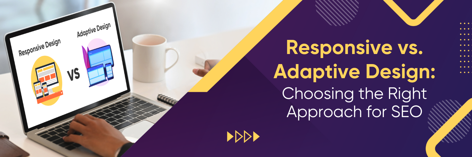
Web Design for SEO

In the dynamic world of web design and development, making the right choices can significantly impact your SEO performance. Two prevalent design strategies in this context are responsive and adaptive designs. But which one is the right choice for your website? Let’s dive in to understand more.
With the widespread use of smartphones, tablets, and desktops, websites need to look and function optimally on all these platforms. Enter responsive and adaptive design – two approaches that serve this need. Both play a critical role not just in user experience but also in search engine optimization (SEO).
SEO Implications
Both responsive and adaptive designs have implications for SEO. Search engines like Google prioritize mobile-friendly sites, and both these approaches serve to enhance mobile user experience. With responsive design, the benefit lies in having a single URL for all devices, which simplifies the indexing process for search engines. Adaptive design, while providing a tailored experience, can sometimes pose challenges in terms of duplicate content, since content may be repeated across different layouts. It’s crucial to use the correct implementation and annotations to prevent SEO issues.
What is Responsive Design?

Internet users access websites through a diverse range of devices, each with varying screen sizes and resolutions. From desktop monitors to smartphones, tablets, and even smartwatches, the plethora of device types has made it imperative for websites to be universally accessible. This is where responsive design comes into play.
Responsive design is not just a mere trend; it represents a forward-thinking and flexible web design methodology that ensures the seamless functionality of a website irrespective of the device it’s viewed on. At its core, this design approach ensures that the website’s structure, images, and functionalities are fluid, meaning they can expand, contract, and reposition, depending on the screen size of the device in use.
Imagine browsing a website on a desktop and then shifting to a mobile device. Without a responsive design, users might encounter oversized images that run off the screen, text that’s too small to read without zooming, or even crucial features and links hidden from view. Such experiences can frustrate the user, leading to decreased engagement and lost opportunities for businesses.
Features of Responsive Design
Responsive design is a revolutionary approach to web development that ensures websites and applications can adapt and deliver optimal experiences across a diverse range of devices. Whether a user is accessing a site on a desktop, laptop, tablet, or smartphone, responsive design aims to provide a seamless and intuitive experience. Here’s a detailed look at some of its key features:
1. Fluid Grids
Traditional web design relied on fixed-width layouts, where elements had a set size in pixels. In contrast, responsive design employs fluid grids that use relative units like percentages instead of fixed units like pixels. This allows elements to adjust their size and position based on the screen’s size. As the viewport size changes, the elements on the page reposition and resize fluidly, ensuring that the layout remains coherent and user-friendly on any device.
2. Flexible Images
Just as text and other elements resize according to screen dimensions, images in responsive design are also made to scale within their containing elements. Flexible images prevent them from displaying outside their containers, which can disrupt the layout or aesthetics of a page. By using CSS techniques, developers can ensure that images always fit and resize within their given space, preserving the visual integrity of the website regardless of the device used.
3. CSS Media Queries
Media queries are the backbone of responsive design. They allow designers to apply specific styles and layouts based on various device characteristics, such as width, height, resolution, or even orientation (landscape or portrait). By using media queries, a website can adapt its presentation to fit a vast array of screen sizes and resolutions. This ensures that users always see a version of the site that’s tailored to their specific device, offering the best possible browsing experience.
What is Adaptive Design?

On the other hand, adaptive design is a design approach where the website detects the device type and screen size before loading, and then delivers the most appropriate layout for that device. An adaptive website may have multiple fixed layouts for different devices.
Features of Adaptive Design
Adaptive design, often recognized for its flexibility in web development, offers a tailored approach to web design that aims to deliver an optimized experience to users irrespective of the devices they use. Below are some of its prominent features:
1. Device-Specific Layouts
One of the defining features of adaptive design is its ability to recognize the device a user is accessing a website from and then display a layout that’s specifically designed for that device. Whether a user is on a desktop, tablet, or smartphone, adaptive design ensures that the website’s layout, images, and functionalities are tailored to the specific screen size and resolution of the said device. This means no more awkward resizing or scrolling sideways; every element is where it should be.
2. Faster Loading Times on Mobile
Given that adaptive design has layouts optimized for specific devices, it also means that only necessary resources for that device are loaded. For instance, when accessing an adaptive website from a mobile device, the site may load smaller image files suitable for mobile displays rather than larger, high-resolution images meant for desktops. This selective resource loading drastically improves loading times on mobile devices, which is a boon for users who often have limited bandwidth or are on the go.
3. Optimized User Experience for Specific Devices
Beyond just layouts and loading times, adaptive design dives deeper into the realm of user experience. It considers device-specific features and limitations. For example, touchscreen functionality is more prevalent on mobile devices and tablets than on desktops. An adaptive design can enhance buttons and navigation for touch inputs when accessed from a mobile device. Similarly, hover effects that work well with a mouse might be reimagined or omitted for touch devices. All these adjustments ensure that users get the best possible experience tailored to their device’s capabilities.
Need help with your Website Design and SEO? Contact Us.
Comparing Responsive and Adaptive Design
Now, let’s weigh both designs based on crucial factors.

Both aim to optimize user experience across various devices, but they approach this goal differently. To discern which is more suitable for a given project, one must weigh both designs based on several crucial factors.
1. Loading Speed

So, let’s picture this. You’re at a cafe, sipping on your favourite latte, and you decide to browse a website on your smartphone. If this site uses an adaptive design, it’s like the barista who remembers your exact coffee order, down to the temperature and the extra shot of vanilla. Adaptive design tailors the web experience specifically for your device. It says, “Hey, you’re on a smartphone! Let me just give you the content that looks and works best for this screen.” This means it only loads up the essentials, the bits that matter for your particular device. The result? Pages that usually load up pretty snappily, giving you more time to enjoy that latte.
On the flip side, let’s talk about responsive design. Now, responsive design is like that overenthusiastic friend who packs for a weekend trip as if they’re going on a month-long vacation – they want to be prepared for EVERYTHING. When you access a responsively designed site, it’s eager to load everything, whether you need it or not. It’s thinking, “I’ve got all this cool stuff, and I’ll adjust it to fit your screen, whether you’re on a desktop, tablet, or phone.”
Sounds good, right? But there’s a catch. Because it’s loading everything – even the stuff you don’t necessarily need on your smartphone – it might take a tad longer. It’s versatile, yes, but sometimes, you’ll find yourself waiting a bit as it gets itself together.
2. User Experience
The core objective remains consistent: to provide the best user experience possible. Both responsive and adaptive designs are front-runners in this quest, but they approach the problem in distinct ways.
Responsive Design and User Experience
At its core, responsive design is about fluidity and consistency. It seeks to present web content in a manner that seamlessly moulds itself to fit the contours of any screen size, ensuring that the user interface remains consistent and predictable.
For users, this means the experience of navigating a website on a smartphone would be quite similar to that on a desktop or tablet. The continuity provided by responsive design is especially valuable in our digital age, where users might begin a task on one device and complete it on another. They’re assured of a uniform design, navigation, and overall user experience, no matter where they access the site. However, this one-size-fits-all approach can occasionally fall short in catering to the unique strengths and limitations of individual devices, potentially resulting in suboptimal user experiences in specific scenarios.
Adaptive Design and User Experience:
Conversely, adaptive design takes a more bespoke approach, honing in on the idea that different devices offer distinct user experiences and therefore deserve tailored designs. By detecting the device type and screen size early on, the adaptive design delivers a layout and user interface specifically crafted for that device.
For instance, a website viewed on a mobile might have larger buttons suitable for touchscreens, while the same site on a desktop might offer a more expansive layout with additional sidebars or features. This level of customization can significantly enhance usability and engagement, ensuring that users get the best experience suited to their specific device’s strengths. Yet, this approach comes with its set of challenges. The constant evolution of devices and screen sizes means designers need to continually update and refine layouts, potentially leading to more maintenance work and the risk of neglecting some less common device formats.
In essence, when it comes to user experience, the debate between responsive and adaptive design isn’t about which is categorically better but rather which is more suited to a particular project’s objectives and constraints. While responsive design promises a unified and consistent experience across the board, adaptive design aims to perfect the user experience for each specific device. The choice between the two should be influenced by an in-depth understanding of the target audience, the resources available for ongoing maintenance, and the desired user journey and outcomes.
How Responsive and Adaptive Design Impact SEO
SEO should be at the core of any design decision. Here’s how both designs can influence it.

1. Mobile-First Indexing
In the contemporary digital age, the prevalence of mobile devices has shaped how search engines, notably Google, index and rank websites. Google’s transition to mobile-first indexing underscores the importance of ensuring that websites are optimized for mobile use. Mobile-first indexing means that Google predominantly uses the mobile version of the content for indexing and ranking. In this context, both responsive and adaptive designs play pivotal roles.
Responsive design, with its fluidity, ensures that the website’s content and layout adjust seamlessly to various screen sizes, offering consistent content across devices. This consistency is beneficial as search engines don’t have to crawl multiple versions of a site. Adaptive design, on the other hand, tailors the website experience to specific devices. If implemented correctly, this can ensure that mobile users receive a version of the site that’s precisely optimized for their device, which can potentially enhance user experience and align with mobile-first indexing principles. However, it’s essential to ensure that all content versions in adaptive design are accessible and crawlable to avoid content disparity issues.
2. Site Speed and Performance
The speed at which a website loads is not only crucial for user experience but also carries significant weight in search engine ranking algorithms. Slow-loading websites can be penalized, resulting in lower rankings. In the battle between responsive and adaptive designs concerning speed, adaptive design might have an advantage. Since adaptive design delivers content specifically tailored to a user’s device, it often serves only the necessary assets, reducing load times. Responsive design, while inherently flexible, may sometimes lead devices to download assets that aren’t essential for the particular screen size, potentially impacting site speed. Nonetheless, with optimized images, efficient coding practices, and modern server technology, responsive sites can also achieve competitive loading speeds.
3. User Engagement and Bounce Rate
Engagement metrics, including bounce rate (the percentage of visitors who navigate away from the site after viewing only one page), play an integral role in SEO. A site that keeps users engaged, leading to lower bounce rates, is likely viewed more favourably by search engines. The user experience, shaped in part by whether a site uses responsive or adaptive design, significantly influences these metrics.
A responsive website provides a consistent user experience across devices, which can be beneficial for brands that have a diverse audience using various devices. Consistency in design can lead to better user familiarity and potentially increased engagement. Adaptive design, meanwhile, offers a more tailored experience. For websites where the majority of traffic comes from specific devices, this can be advantageous. For instance, if a site’s primary audience primarily uses tablets, an adaptive design optimized for tablet use might result in a more intuitive, engaging experience, thereby reducing bounce rates.
Making the Choice: Responsive vs. Adaptive Website
Deciding between responsive and adaptive design depends on your unique needs.

When to Choose Responsive Web Design?
Responsive design acts as a one-size-fits-all solution. It offers a fluid design structure that morphs to fit any device it’s viewed on. Choosing responsive design guarantees consistency. No matter if your visitors are on their widescreen monitor at work or their smartphone during a commute, they will experience a consistent layout, which can be instrumental in building brand trust and recognition.
Moreover, the sheer unpredictability of the devices your audience might use makes responsive design a preferred choice for many. As new screen sizes and device categories emerge, a responsive design will naturally adjust, negating the need for multiple redesigns or updates. If you aim for broad outreach and anticipate that your audience will access your website from a wide array of devices, responsive design is the ideal path. It minimizes the chances of running into layout or compatibility issues and ensures every user gets a uniformly excellent experience.
When to Choose Adaptive Design?
On the other hand, adaptive design has its niche where it truly shines. Suppose you’ve done your audience research and discovered that a significant portion of your users, or perhaps the most valuable segment, primarily interacts with your content through one specific device type. In that case, adaptive design becomes highly relevant. For instance, if your audience predominantly uses mobile devices, an adaptive design can be curated to provide a mobile-centric experience, maximizing the usability and engagement on that particular platform.
Furthermore, adaptive design allows for a hyper-targeted user experience. It recognizes the device accessing the website and serves a layout specifically tailored for that device. This means that designers can optimize every pixel, every interaction, and every feature to suit the particular device’s strengths and limitations. For businesses that demand this level of customization and aim to provide an unparalleled user experience on specific devices, adaptive design is the right choice.
Conclusion

The decision between responsive and adaptive design shouldn’t be made lightly. It requires a deep understanding of your audience’s habits, preferences, and the technological landscape they operate within.
Both design strategies offer unique benefits. While responsive design ensures consistency and broad device compatibility, adaptive design offers a level of customization and optimization that’s hard to match. Evaluate your business’s specific needs, and choose the approach that aligns best with your goals.
However, navigating the complexities of design and SEO can be daunting. This is where partnering with a seasoned expert can make all the difference. Ubique Digital Solutions has a proven track record in harmonizing design techniques with SEO strategies. Let us be the catalyst that propels your online presence to unparalleled heights. Contact us today.
FAQs
Q: What is the difference between responsive and adaptive design?
Responsive design is fluid and adjusts to any screen size, while adaptive design has fixed layouts for specific screen sizes.
Q: Which design is better for SEO?
Both designs can positively impact SEO, but the choice depends on factors like your audience, website speed, and user experience.
Q: Does Google prefer responsive or adaptive design?
Google recommends responsive design as it’s more efficient for Google to crawl and index.
Q: Why choose responsive design?
Choose a responsive design for its flexibility, consistency across devices, and compatibility with Google’s mobile-first indexing.
Q: Why choose adaptive design?
Choose an adaptive design for its faster loading times, tailored user experience, and if your audience primarily uses one type of device.


