What is Data Visualization?
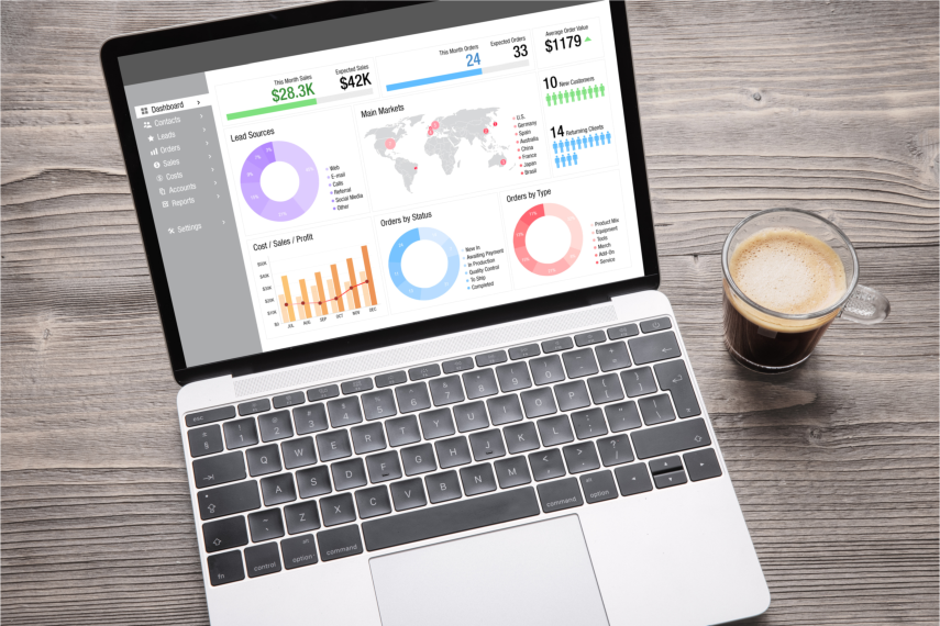
Data visualization is the process of showing data in visual formats like charts, graphs, and maps. It helps us understand and analyze complex information by presenting it in an easy-to-understand way. Instead of looking at raw numbers and figures, we can see patterns, trends, and insights more clearly. It’s like turning data into pictures that make it easier for us to make sense of the information.
Data visualization tools play a crucial role in helping businesses make sense of their data by transforming raw information into visually appealing and easy-to-understand charts, graphs, and dashboards. These tools enable organizations to uncover valuable insights, make informed decisions, and communicate data-driven findings effectively.
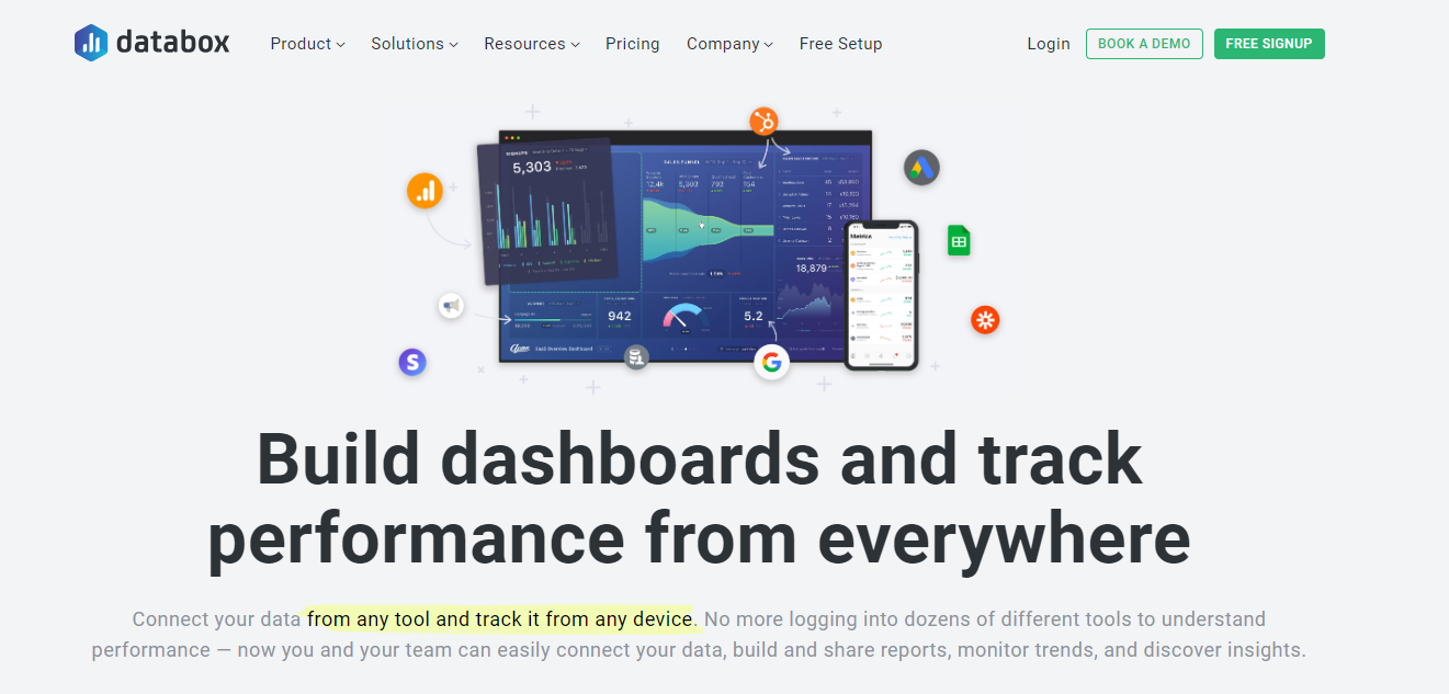
One popular data visualization tool is Databox. It offers a range of features and capabilities that allow users to create stunning visualizations and monitor key metrics in real-time. However, it’s essential to explore alternative options to Databox to ensure you find the right tool that best suits your specific needs and requirements.
What to Consider When Choosing a Data Visualization Tool
Features and Functionality
When evaluating data visualization tools, it’s crucial to consider their features and functionality. Look for tools that offer a wide range of visualization options, including charts, graphs, maps, and interactive dashboards. The tool should provide flexibility in customizing visualizations to match your branding and reporting requirements.
Additionally, consider features such as data filtering, drill-down capabilities, and the ability to create calculated fields. These features allow you to dive deeper into your data, uncover hidden patterns, and perform complex analyses. Depending on your business needs, you may prioritize features like collaboration and sharing options, data storytelling capabilities, or advanced analytics functionalities.
Integrations and Data Sources
Integrations and data sources are crucial aspects to consider when selecting a data visualization tool. Evaluate whether the tool integrates seamlessly with your existing data systems, such as databases, CRMs, marketing platforms, or cloud storage services. A robust integration capability ensures that you can easily connect to your data sources without manual data imports or exports.
Furthermore, check if the tool supports popular data sources like Google Analytics, Salesforce, or social media platforms. The ability to pull data from multiple sources into a centralized dashboard provides a comprehensive view of your business performance. Ensure that the tool offers data connectors or APIs for connecting to the specific data sources relevant to your organization.
Scalability and Performance
Scalability and performance are critical factors when dealing with large datasets or real-time data updates. Consider the tool’s ability to handle increasing data volumes without sacrificing performance. Look for tools that offer in-memory processing or efficient caching mechanisms to ensure quick and responsive visualizations, even with vast amounts of data.
Furthermore, evaluate how the tool handles real-time data updates. Real-time analytics and visualization can be crucial for industries such as finance or e-commerce, where timely insights are essential. Consider whether the tool supports streaming data sources or offers near real-time data refresh rates to ensure you can monitor and react to changes as they happen.
8 Best Databox Alternatives
#1 Tableau
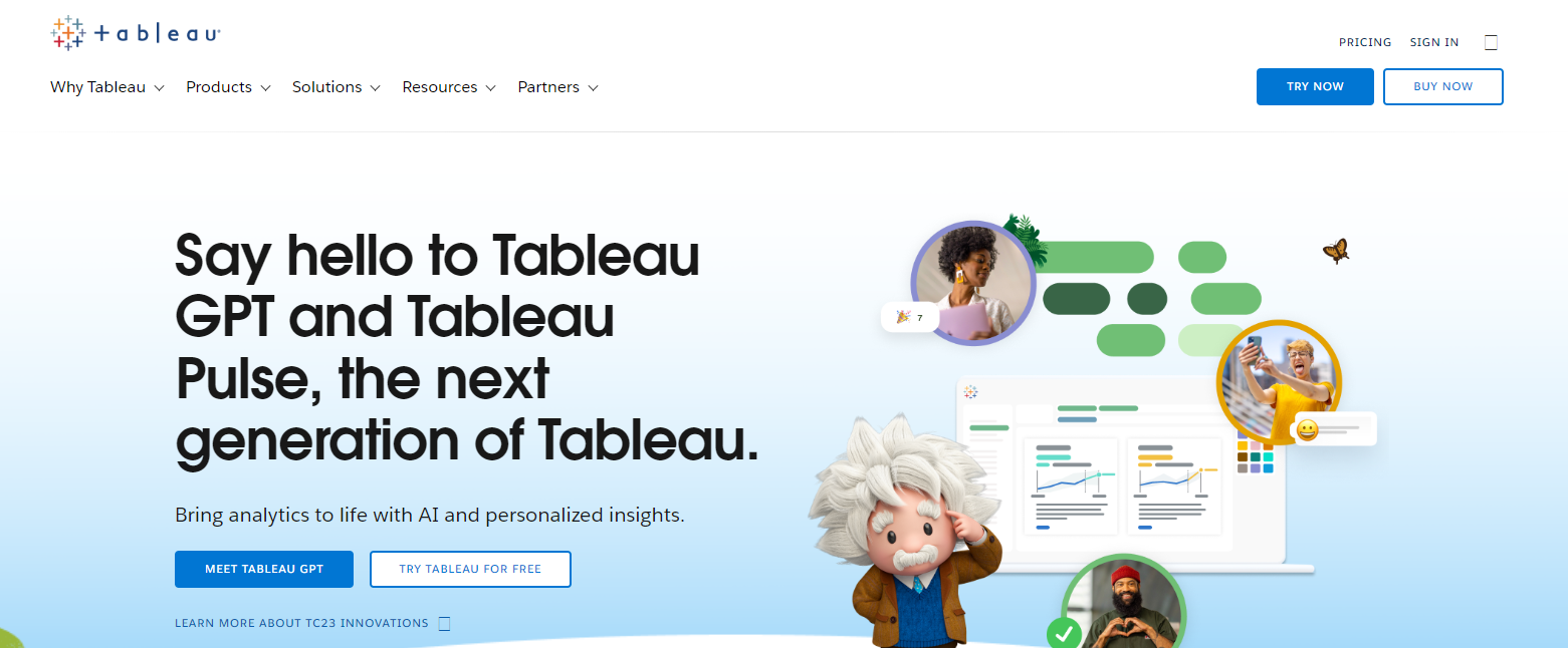
Tableau is a powerful data visualization tool that provides an extensive range of features and capabilities. It offers a user-friendly interface, drag-and-drop functionality, and a wide variety of visualizations. Tableau supports multiple data sources and provides seamless integration with popular platforms like Google Analytics, Salesforce, and more. Its pricing plans vary based on the intended usage, and user reviews often highlight its robust functionality and ease of use.
#2 Looker
Looker is a data platform that offers comprehensive data visualization and exploration capabilities. It provides a modern and intuitive interface for building interactive dashboards and exploring data. Looker supports various data sources and offers robust integration options. Pricing for Looker is typically based on a per-user or per-data-consumer basis, and user reviews often mention its strong data modeling and collaboration features.
#3 Power BI
Power BI is a widely used data visualization tool offered by Microsoft. It provides a range of visualization options, including interactive dashboards, reports, and AI-powered insights. Power BI seamlessly integrates with Microsoft’s ecosystem, including Azure services, Excel, and SQL Server. It offers both free and paid versions, with advanced features available in the paid plans. User reviews often praise Power BI for its ease of use and integration capabilities.
#4 QlikView
QlikView is a business intelligence tool known for its associative data model, which enables users to explore data dynamically and make new associations. It offers a robust set of visualization options, data governance features, and a drag-and-drop interface for creating dashboards. QlikView supports various data sources and has flexible pricing options. User reviews often mention its powerful associative analytics and intuitive interface.
#5 Google Data Studio
Google Data Studio is a free data visualization and reporting tool offered by Google. It allows users to create customizable and interactive dashboards using data from various sources, including Google Analytics, Google Sheets, and more. Data Studio offers easy sharing and collaboration options, making it suitable for teams. User reviews often highlight its simplicity, seamless integration with Google products, and cost-effectiveness.
#6 Sisense
Sisense is a robust data visualization and analytics platform designed for complex data scenarios. It offers a wide range of visualizations, advanced analytics capabilities, and AI-powered features. Sisense supports various data sources and provides extensive customization options. Pricing for Sisense is based on a per-user or per-consumer model. User reviews often praise Sisense for its scalability, powerful analytics engine, and flexible deployment options.
#7 Chartio
Chartio is a cloud-based data exploration and visualization tool that focuses on simplicity and ease of use. It offers a drag-and-drop interface, pre-built data connectors, and a variety of visualization options. Chartio integrates with popular data sources and provides robust sharing and collaboration features. Pricing for Chartio is typically based on a per-user or per-dataset basis. User reviews often mention its intuitive interface and quick setup process.
#8 Zoho Analytics
Zoho Analytics is a comprehensive data visualization and business intelligence tool offered by Zoho. It allows users to create interactive dashboards, reports, and perform ad hoc analyses. Zoho Analytics supports various data sources, offers advanced analytics functionalities, and provides collaboration options. Pricing for Zoho Analytics is based on a tiered subscription model. User reviews often highlight its affordability, ease of use, and extensive data manipulation capabilities.
Conclusion

Selecting the right data visualization tool is crucial for unlocking the full potential of your data. Consider factors such as features and functionality, integrations and data sources, scalability, and performance when evaluating different alternatives to Databox. Each alternative discussed, including Tableau, Looker, Power BI, QlikView, Google Data Studio, Sisense, Chartio, and Zoho Analytics, brings its unique strengths and pricing models. Assess your organization’s specific needs and requirements to choose the alternative that best fits your business goals.
To ensure a seamless and successful integration of your chosen data visualization tool, it is highly recommended to partner with a trusted and experienced digital solutions provider like Ubique Digital Solutions. Our team of experts has extensive knowledge and expertise in implementing and optimizing various data visualization tools, including Databox alternatives. We can assist you in selecting the right tool, setting up integrations, and maximizing the value of your data insights.
Don’t miss out on the opportunity to boost your business to success through effective data visualization. Contact Ubique Digital Solutions today to discuss your requirements and embark on a data-driven journey that will propel your business forward. Let us be your trusted partner in unlocking the power of your data and driving growth and success.
FAQs:
Q: How do I determine which data visualization tool is right for my business?
Choosing the right data visualization tool for your business requires assessing your specific needs and priorities. Consider factors such as features, integrations, scalability, pricing, and user-friendliness. It’s recommended to trial multiple tools, involve stakeholders, and evaluate their ability to meet your organization’s unique requirements.
Q: Are there any free alternatives to Databox?
Yes, there are free alternatives to Databox, such as Google Data Studio. These tools offer basic data visualization and reporting capabilities without requiring a financial investment. However, they may have limitations in terms of advanced features, data source connections, or user scalability.
Q: Can these alternatives integrate with popular data sources like Google Analytics and Salesforce?
Yes, many of the mentioned alternatives, including Tableau, Looker, Power BI, and Zoho Analytics, offer integration capabilities with popular data sources like Google Analytics and Salesforce. It’s important to review each tool’s documentation or contact their support to confirm specific integration capabilities.
Q: Which alternative is best suited for real-time data visualization?
Several alternatives, such as Tableau, Power BI, and Sisense, offer real-time data visualization capabilities. These tools can connect to real-time data sources or provide near real-time data refresh rates, enabling you to monitor and visualize data as it updates in real-time.
Q: Do these alternatives offer mobile support for accessing dashboards on the go?
Yes, many of the data visualization tools mentioned in this blog, including Tableau, Power BI, and Google Data Studio, offer mobile support. They provide mobile apps or responsive web interfaces that allow users to access and interact with dashboards on their mobile devices, ensuring data accessibility on the go.